Brand Story
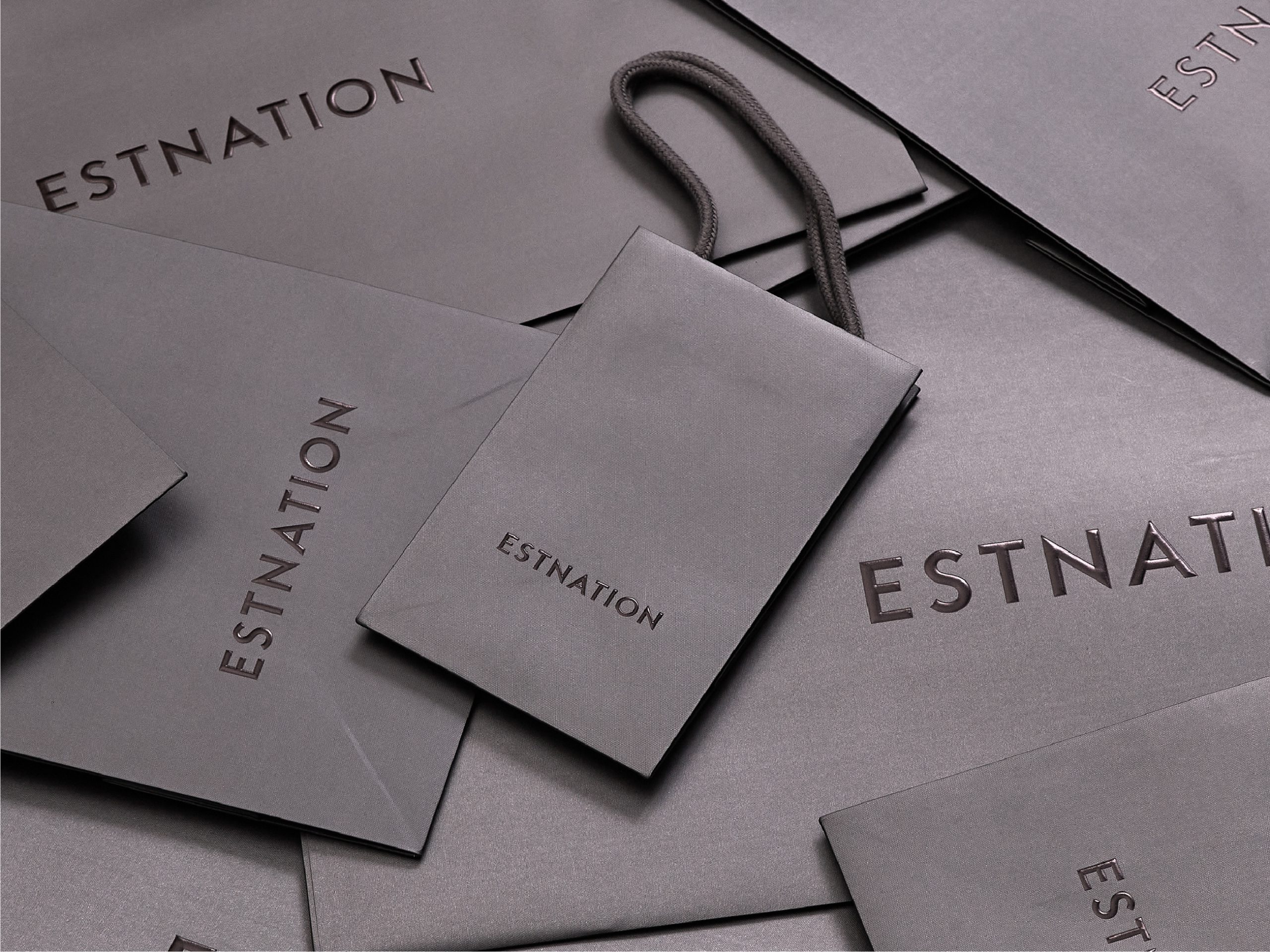
ESTNATION Shopping Bag Redesign
- CD / AD / D : REGAN Group
- CL : ESTNATION
- Category : Brand Story
Infusing the Essence of Luxury into Every Hands-On Moment
The Essence of Luxury
For ESTNATION, luxury has never been merely about high price points. It is defined by the intrinsic quality of materials, the dedication of the makers, and the entire sensory experience that unfolds around them.
When ESTNATION invited REGAN to partner on the renewal of their signature retail shopping bags, our perspective looked far beyond everyday packaging. At first glance, a shopping bag is simply a tool for carrying purchases home. For a luxury specialty store, however, it is an enduring touchpoint that extends well beyond the boutique doors. It accompanies the customer through the city streets, enters their private residence, and catches the eyes of passersby along the way. In essence, it stretches the intimate connection between client and brand into the public sphere.
Our challenge was never just to produce an aesthetically pleasing paper bag. Instead, we sought to preserve the poise and elevated universe of ESTNATION while scrutinizing every practical nuance—from operational agility on the retail floor to the quiet hospitality extended to each customer.
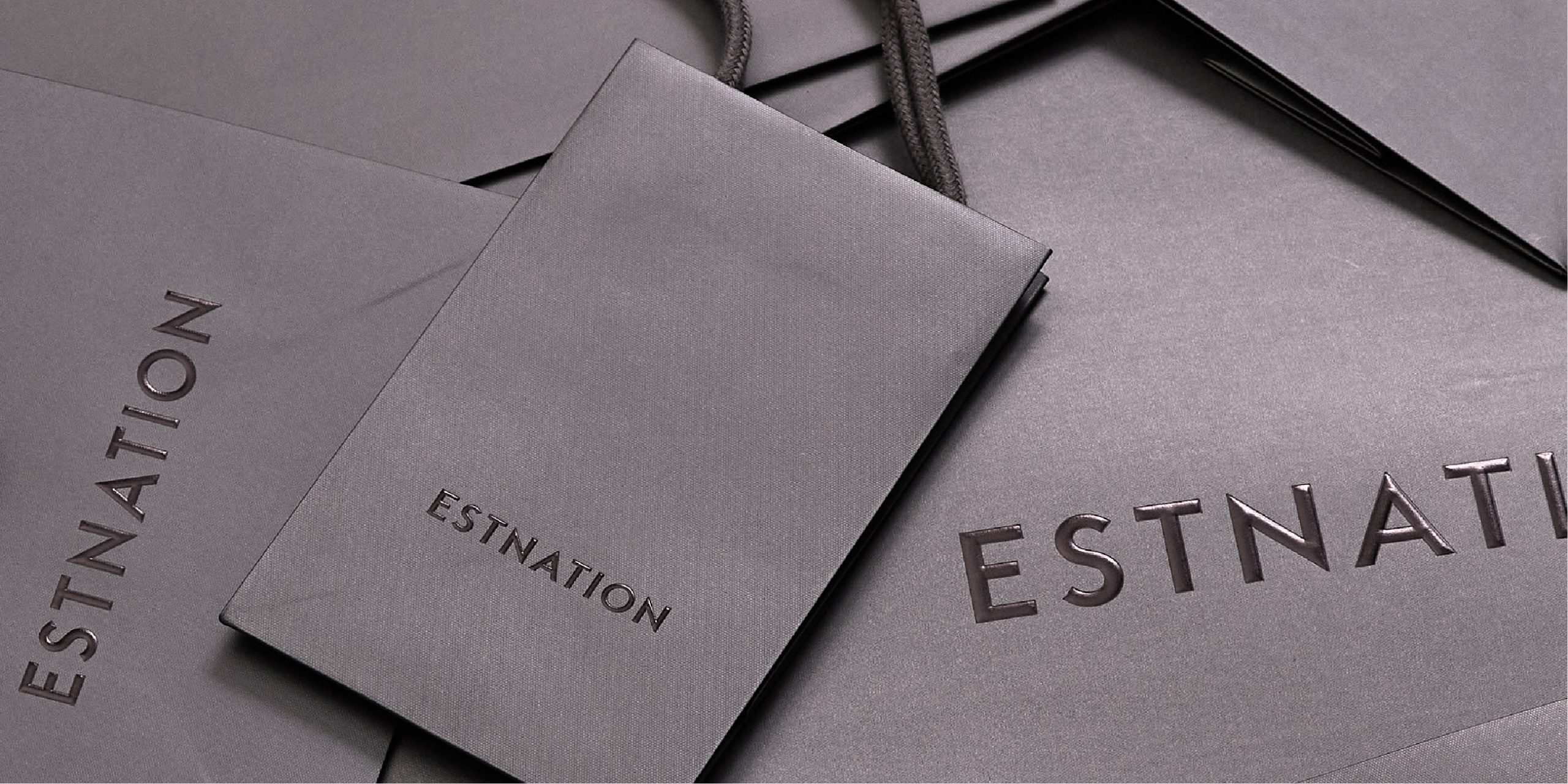
Designing Function as Art: Beyond Visual Surface
This initiative coincided with a comprehensive refresh of ESTNATION’s brand logotype. A luxury bag lineup must accommodate an eclectic range of product dimensions and curated gifting needs. At the same time, expanding sizes without discipline introduces operational friction and storage complexity in stores. Balancing brand elegance with back-of-house rationality became our foundational objective.
The client’s initial brief requested consolidating the previous six-size lineup into five essential formats. Rather than simply trimming sizes, we held deep consultations with frontline store associates to map real-world usage scenarios. Testing dozens of structural variations, we evaluated how items fit inside, the ergonomics of the carry handles, and the speed of daily packing.
To guide the dimensional development beyond pure mechanics, we introduced the Hakugin-hi (the Japanese silver ratio: 1:√2), a proportion historically revered in Japanese architecture and classical fine arts. We wanted the suite of bags to feel harmonious not merely as individual pieces, but as a balanced visual ensemble when displayed together behind the counter. Based on this structural logic, four of our five proposed sizing prototypes were directly selected for final production.
We avoided leaning solely on theoretical math or subjective intuition. By rooting the process in foundational design proportions and validating them against intensive floor testing, we achieved a natural coexistence between utility and poise.
Equal attention was paid to the collective presence of the bags. Across varying dimensions, every bag had to convey an unmistakable ESTNATION elegance. We guided the strategic choices for logo positioning, scaling, paper weight, tactile texture, and embossing techniques, weighing each against brand perception and physical hand-feel. With every prototype round, store feedback was gathered and debated collaboratively between ESTNATION, the packaging manufacturers, and REGAN. Combining our distinct domains of expertise, we continually iterated until arriving at an uncompromised standard.

Crafting the Lingering Resonance of a Brand
Our ultimate goal was neither just a functional carrier nor an ostentatious luxury bag, but one that effortlessly embodies both.
It is discovered in the tactile weight felt the moment it is handed across the counter, the clean posture it maintains while walking through town, the understated glimpse of the logo in transit, and the serene brand presence it holds once brought into the home. A shopping bag does not conclude its service at the checkout counter. Instead, it carries the emotional afterglow of the boutique visit, seamlessly integrating the brand into a customer’s everyday surroundings.
This is why the dignity and aesthetic discernment central to ESTNATION needed to speak with quiet confidence rather than loud branding. By elevating functional utility, we strengthened its emotional presence. By solving everyday retail handling, we preserved a delicate consideration for the guest.
True brand equity does not reside exclusively in high-level campaigns or logos; it lives inside the tactile embrace of a single shopping bag. At REGAN, we look past surface styling to examine how brand values are genuinely felt at every physical intersection. Designing the quiet value within the finest details—that is how brand memory is made.