Brand Story
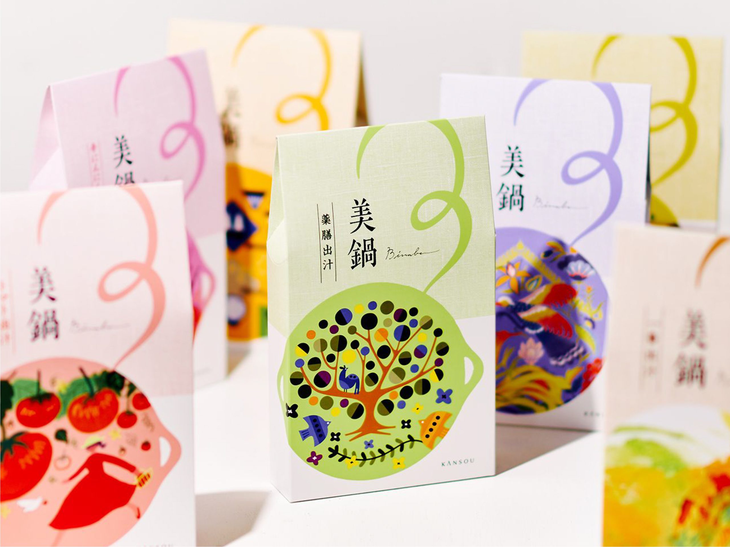
Kansou Bi-Nabe
- CD / AD / D : REGAN Group
- CL : Kansou
- Category : Brand Story
From Hot Pot Broth to Contemporary Dashi Culture
Bringing 240 Years of Flavor to Modern Tables
Founded in 1781 in Utsubo, Osaka, as a seafood wholesaler, Kansou has long been guided by its philosophy: "Time honored, quality refined. The taste of tradition." For over 240 years, its craft and flavors have been cherished across generations. Long lines forming outside department stores before opening just to secure a limited batch of its signature shiokonbu (salted kelp) became an iconic scene defining the brand.
Yet the modern landscape surrounding home dining has shifted dramatically. With the rise of nuclear households, evolving dietary preferences, and the convenience food market, Kansou recognized an opportunity: to look beyond shiokonbu and become a cultural conduit, passing the essence of Japanese dashi (broth) culture forward to the next generation through a new line of offerings.
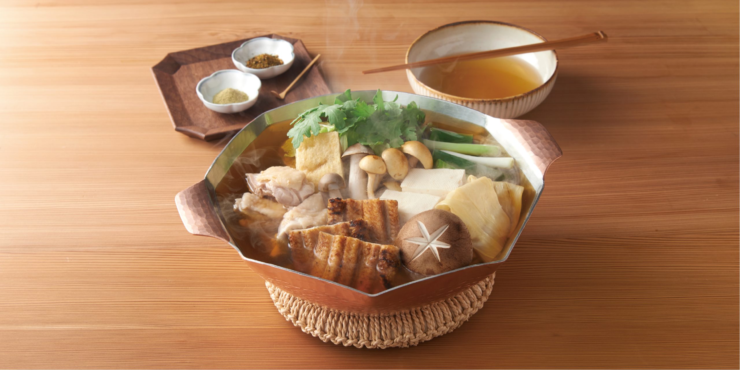
Reexamining the Essence of Dashi Through Hot Pot Broth
When people think of broth in everyday cooking today, hot pot bases instantly come to mind. The grocery aisles are filled with ready-to-use options requiring no dilution. While convenience is undeniably valuable, we had to ask: how much of the true, foundational taste of Japanese dashi culture actually survives in these products?
That question led Kansou to fundamentally rethink what a hot pot base could be. With its rigorous ingredient selection, insistence on natural sourcing, and centuries spent pursuing the true nature of deliciousness, Kansou was uniquely positioned to create something distinct.
From that conviction emerged a new sub-brand: Bi-Nabe.
Delicious and aesthetically pleasing—a small indulgence for everyday meals. Bi-Nabe was never intended to be just another tasty soup base. Rooted in Kansou’s exacting ingredient standards and a deep appreciation for nature's bounty, it was designed to introduce a quiet, special moment into busy daily routines. This defined the core brand DNA: "Delicious, beautiful, and a daily reward at the table."
Shaping that identity meant looking beyond taste to craft the visual presence and entire dining experience—beginning with the packaging itself.
Invoking Taste Through Imagination Rather Than Finished Dishes
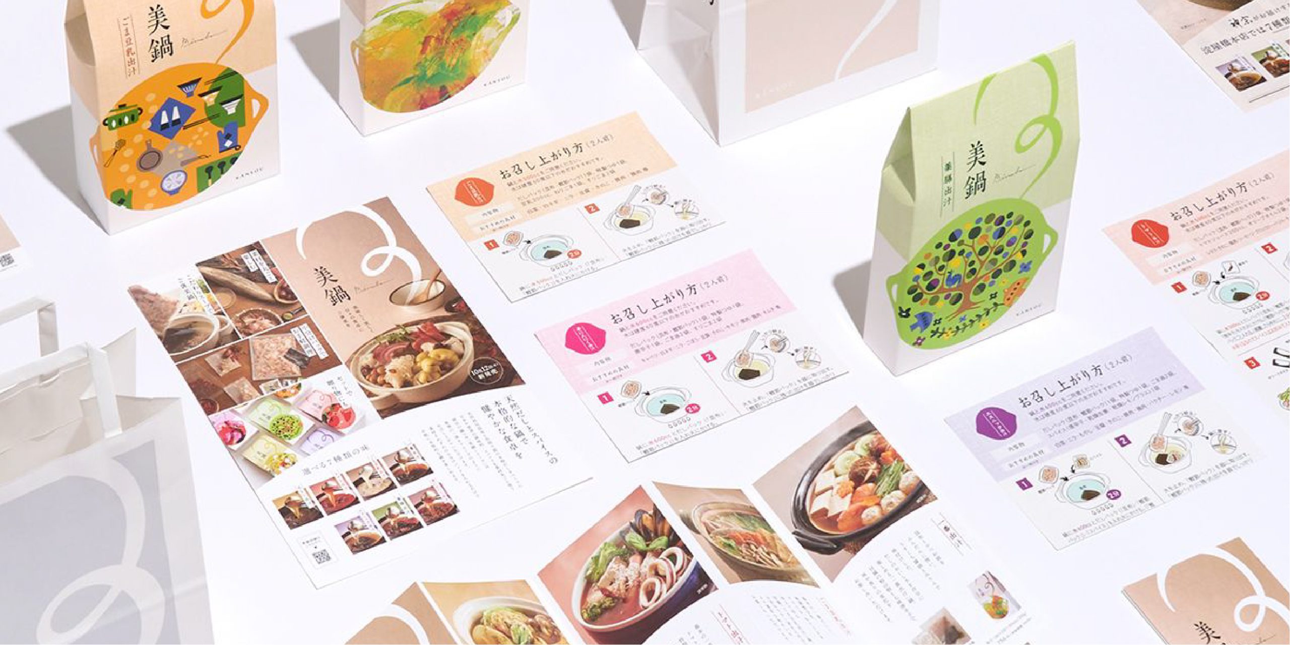
Conventional hot pot base packaging relies heavily on full-bleed photographs of finished meals to communicate flavor. Bi-Nabe deliberately took a different path, turning to expressive illustration to awaken the customer’s imagination.
A tactile base texture reminiscent of woven fabric sets the tone. Across it sit illustrative interpretations unique to each profile, complemented by fluid lines that evoke rising steam and aromatic depth. Instead of presenting an obvious visual of an appetizing pot, the packaging invites the viewer to wonder: What does this taste like? This evocative approach directly embodies Bi-Nabe’s ethos of beauty and flavor in harmony.
To determine how each flavor profile should be articulated visually, we looked beyond domestic talent during our collaborative sessions with Kansou, scouting internationally to commission multiple illustrators. Working through iterative rough sketches tailored to each flavor profile—with some artists taking on multiple varieties—we aligned closely on creative vision. Through subtle adjustments, we shaped seven distinct personalities for the seven broth variations.
While each illustration carries its own character, the collection had to read as a single, cohesive family when lined up on store shelves. REGAN directed the entire packaging system—from illustration and color palette to typographic layout and material finishes—unifying distinct artistic expressions into a coherent brand lineup. Celebrating individual character while maintaining brand harmony was central to the design strategy.
Turning the Creator's Signature into Brand Equity
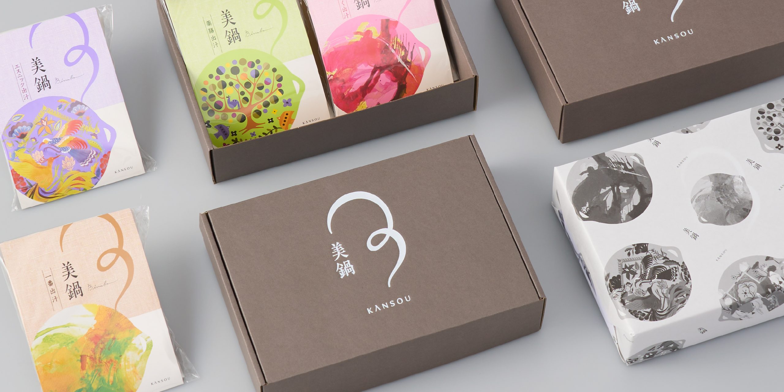
During iterative discussions with Kansou, we suggested featuring the names of the contributing illustrators directly on the packaging. The client embraced the idea, placing each artist's signature along the upper back panel of their respective package. Crediting the illustrator lets consumers feel the human craftsmanship poured into the product, celebrating not only raw ingredients and preparation methods, but every individual contributor behind it as part of the brand's worth.
Bi-Nabe also carries a unique culinary twist: blending two or more broth bases unlocks entirely new layers of depth. Customers who pick up their first package often return to explore different pairings, turning experimentation into natural brand loyalty.
The packaging communicates flavor differences at a glance, inviting people to reach out on the retail shelf and sparking anticipation long before the pot ever touches the stove. By reimagining 240 years of broth heritage into an engaging everyday experience, we continue to uncover the authentic core within tradition, shaping it into products and brands that speak naturally to contemporary life.