Works
Kaltech VI & Packaging
Translating Photocatalytic Technology into a Resonant Brand Identity
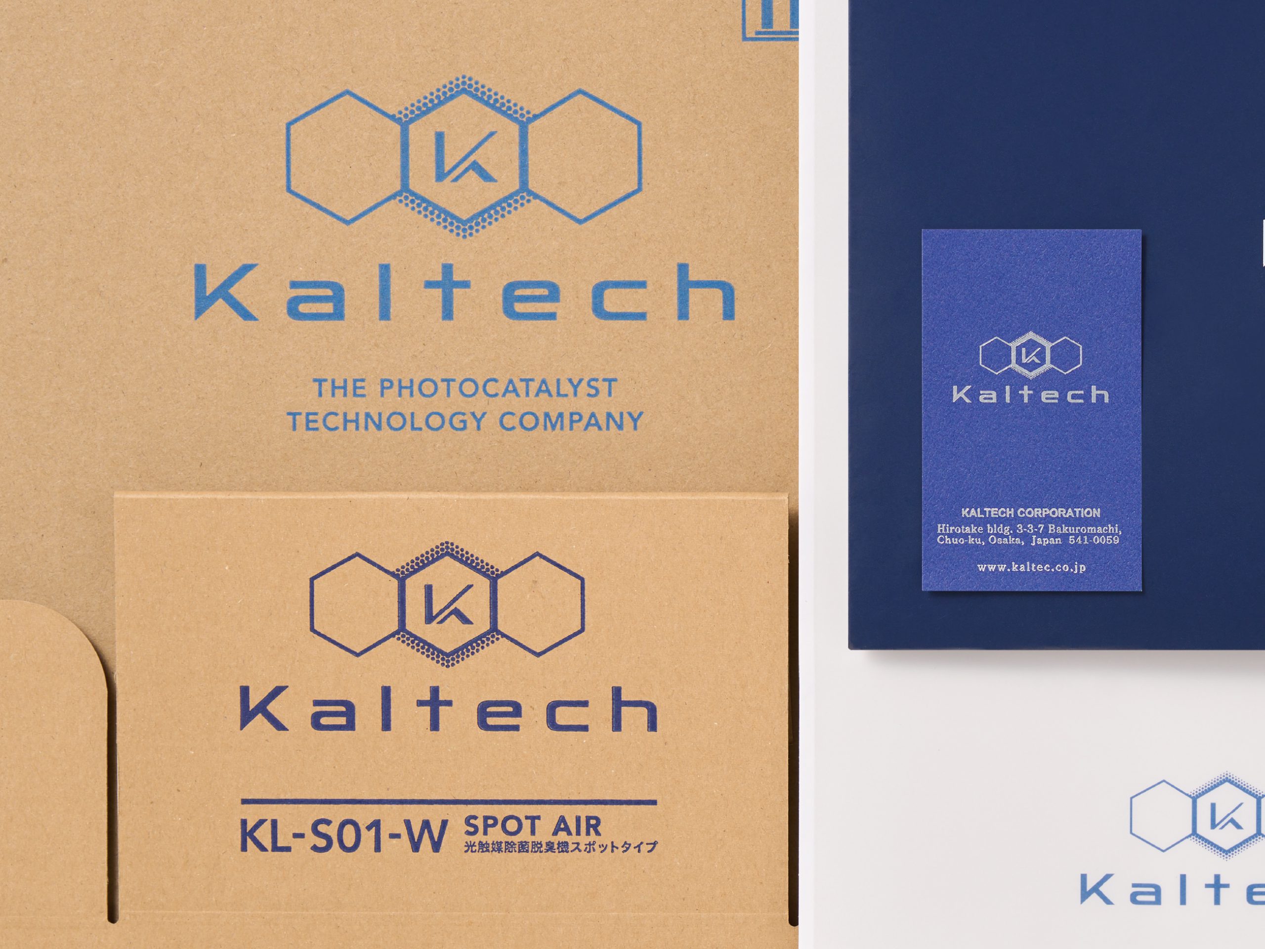
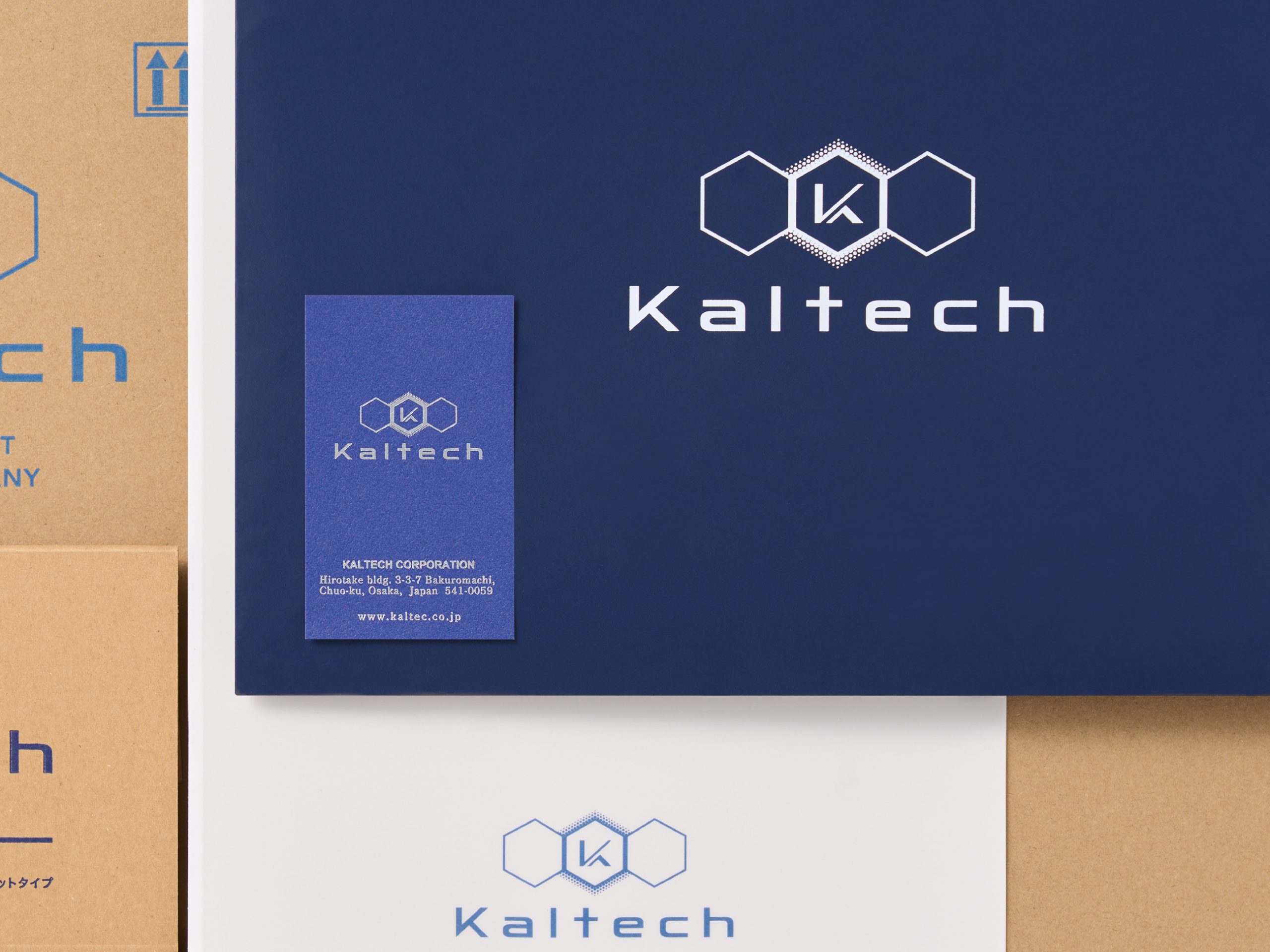
To translate Kaltech’s advanced photocatalytic purification technology clearly to internal teams and external markets, we engineered a unified Visual Identity (VI) system.
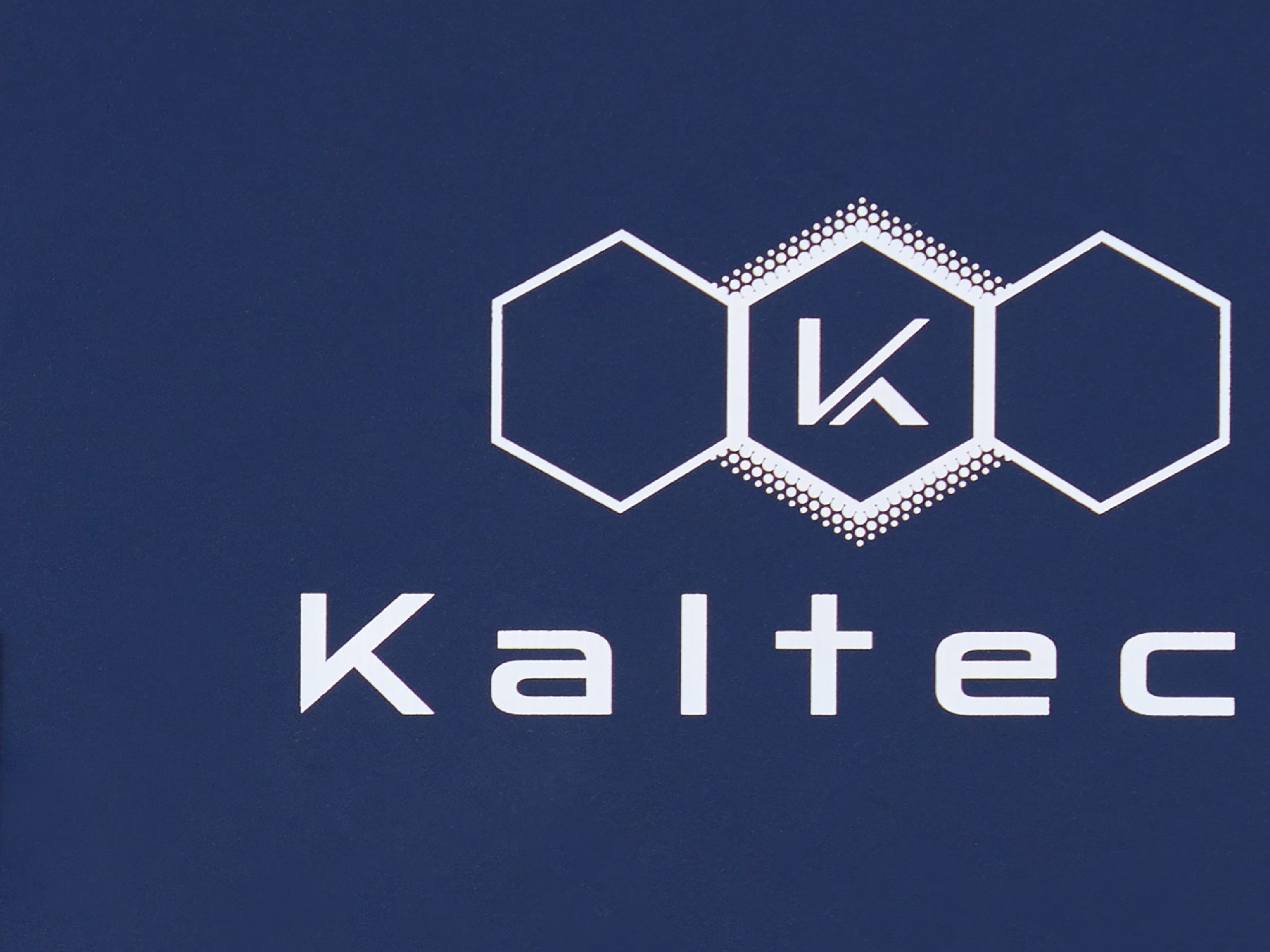
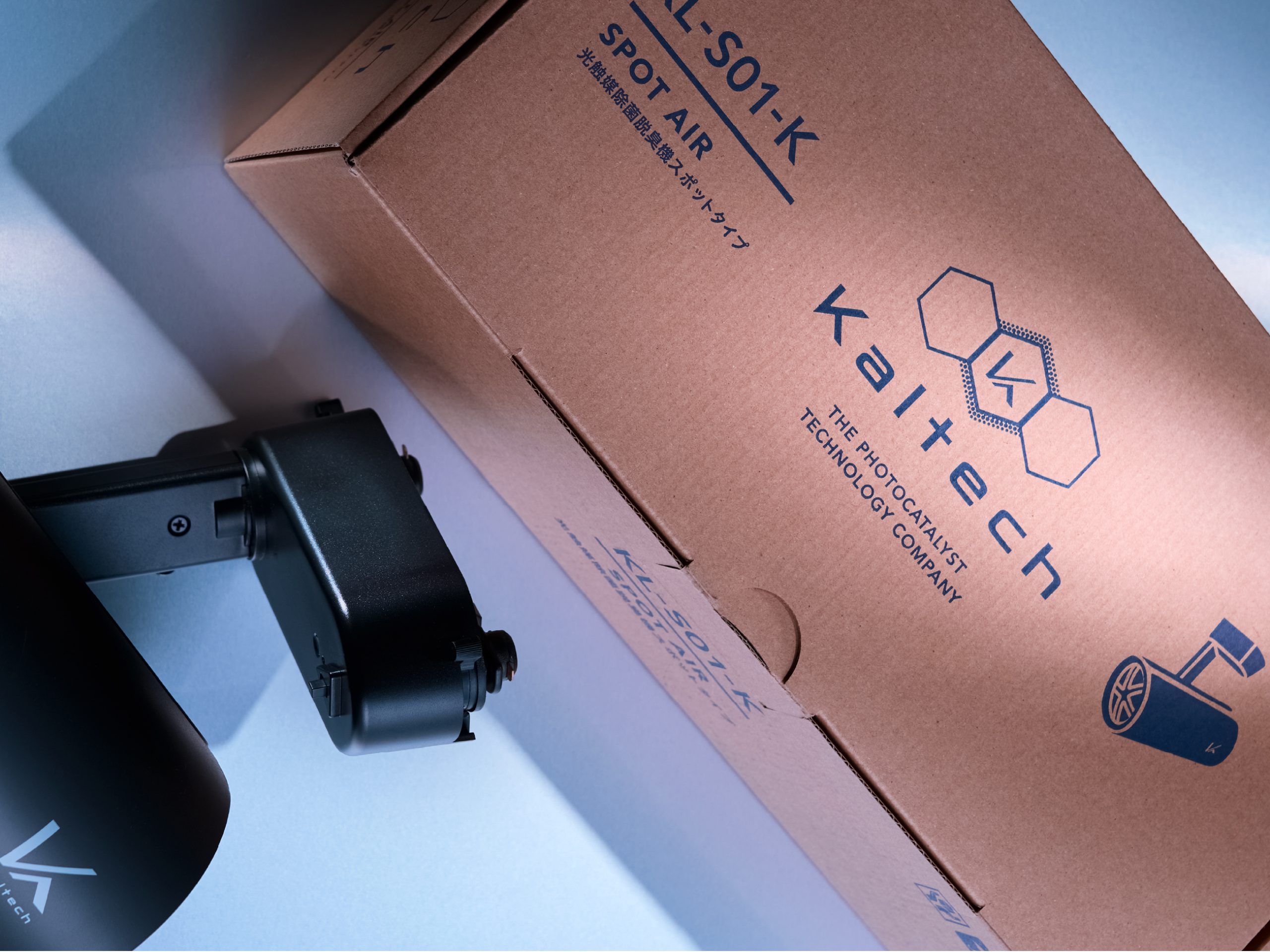
The core symbol mark places Kaltech’s signature "K" within a trio of precise hexagons, flanked by an outward dispersion of dots that visualizes the expansive reach of purification science. The mark was meticulously engineered for clean reproduction across varied physical substrates, fabrication methods, and printing processes. In parallel, we designed an eco-conscious packaging suite optimized to minimize industrial ink consumption, seamlessly extending the visual framework across corporate stationery, digital platforms, and touchpoints.
- CD / AD / D : REGAN Group
- CL : Kaltech
- Category : Branding_Product