Works
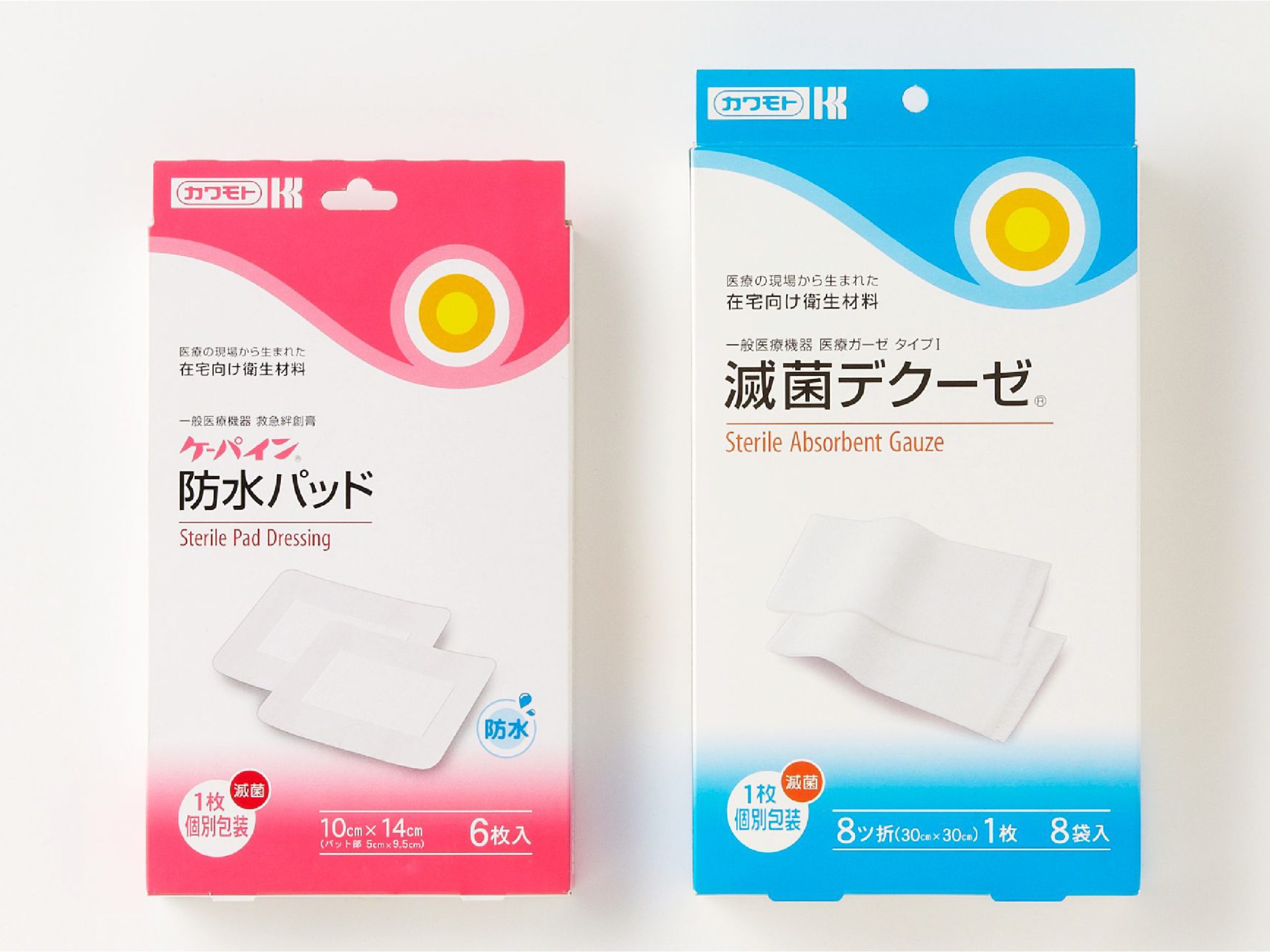
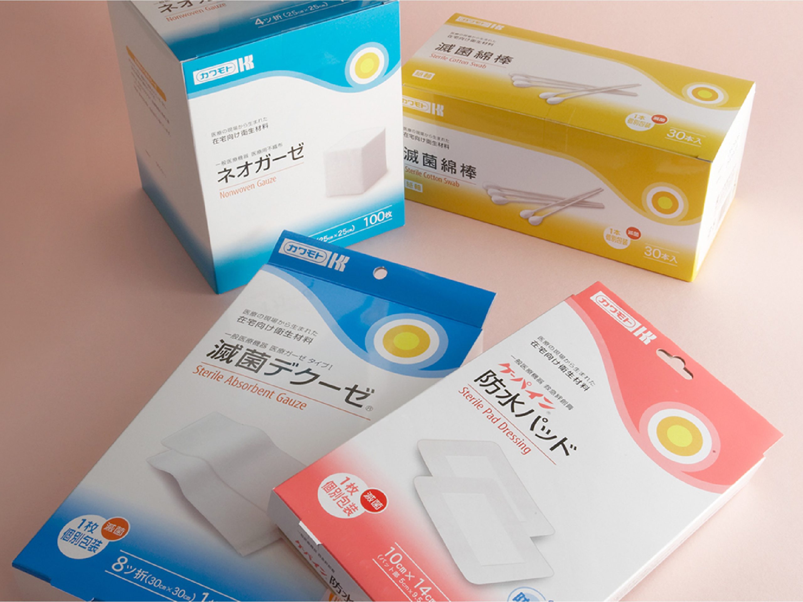
Kawamoto Corporation Medical Packaging Renewal
Translating Clinical Clarity into Cohesive Brand Identity
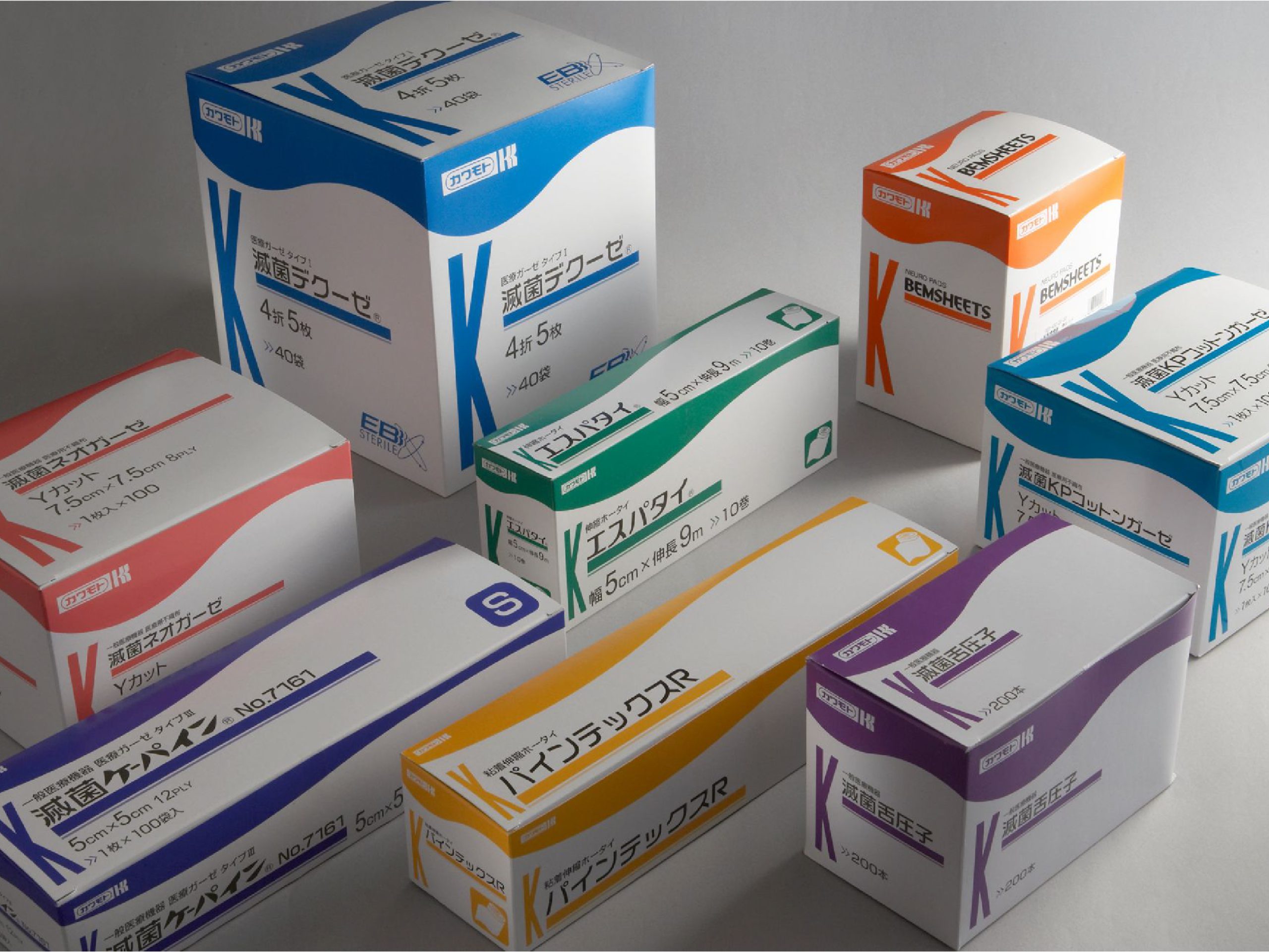
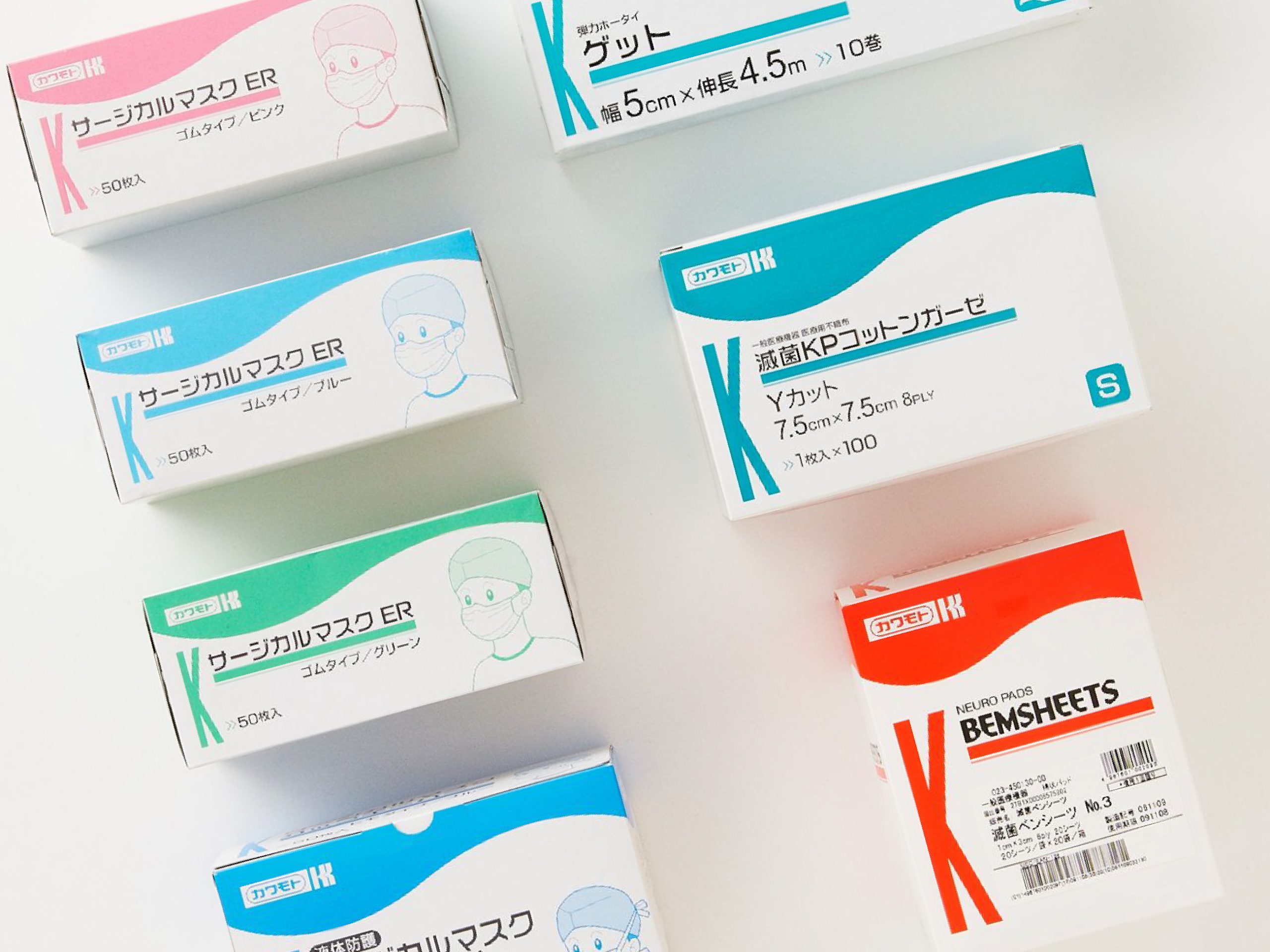
Anchored by the corporate "K" and gentle undulating curves, we spearheaded a comprehensive packaging renewal for Kawamoto Corporation’s extensive medical and healthcare supply lines.
The primary design imperative was immediate, error-free product recognition on demanding hospital floors, ensuring clinicians can instantly distinguish product categories, specifications, and critical characteristics. We calibrated typography hierarchy, font selections, and category color systems across varied carton dimensions, formalizing the entire architecture into an exhaustive brand guideline. Over a phased three-year rollout, this framework unified approximately 300 SKUs, replacing fragmented legacy packaging with a cohesive, professional identity from commercial shipping cartons to bedside clinical supplies.
- CD / AD / D : DESIGN FORCE
PD : DESIGN FORCE - CL : Kawamoto Corporation
- Category : Branding_Product